

Tips for Choosing the color of carpet
Selecting carpet Color
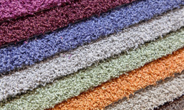
No decision you will make about your carpet will have as significant an impact on your decorating as the color you choose. Carpets have become a focal point for interior design, so don’t make a hasty decision and don’t be afraid to go with a fresh or innovative look. Look at the color of the carpet on the site carpet cleaning Markovic.
Color Providing An Airy Feel
Light colors give rooms a larger overall appearance. Whether you want to make a small breakfast room seem bigger, or make a large living room feel even more open, light color carpeting could provide the effect you’re seeking.
Creating A Cozy Atmosphere
Dark colors make a room appear smaller and cozier. Whether decorating a study, a large master bedroom, or a family room with a vaulted ceiling and fireplace, you may find that dark carpeting helps create the room’s desired comfort.
Warming & Cooling Effects
Colors take their cue from nature. Red and yellow carpeting, reflecting the glow of sunshine, can have a warming effect in a room. Blue and green tones, paralleling the chill of early morning, have a cooling effect.
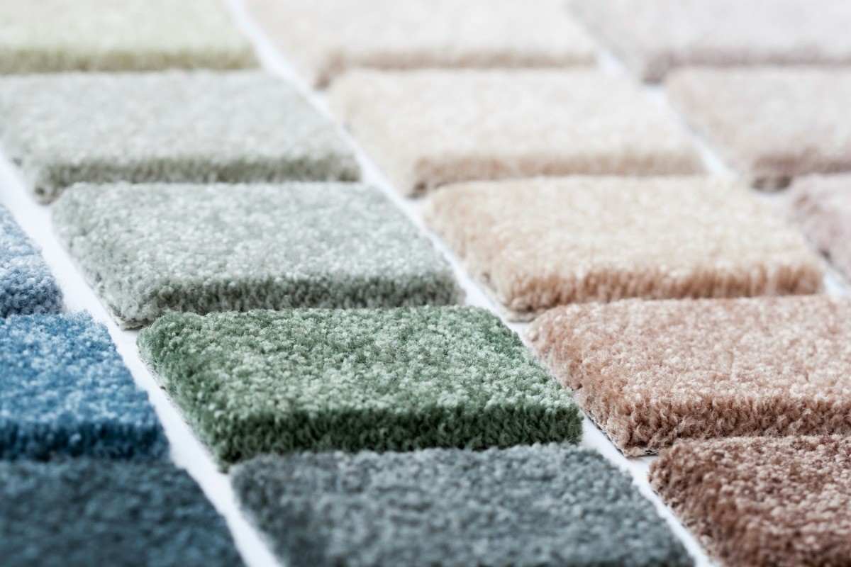
Even Beige Is Not Necessarily Safe
Although considered the most neutral of carpet colors, decorating with beige tones can also be difficult. Beige colors are made of amounts of red, yellow, and blue mixed together. The dominant of these three colors creates the beige’s undertone, which should be consistent and complementary with other colors and other beiges in the room’s decorating elements. Stark and off-white are being replaced by yellow and beige tones, which are easily coordinated with warm color palettes.
Color is psychologically important. It can affect not only the apparent size of a space, but the temperature and mood of a room. The use of warm or cool colors depends on personal preferences, climate and the orientation of your home. Blues and greens often are preferred in rooms having natural light and southern exposure. Warmer colors may be preferred in rooms having northern exposure and little natural light.
Darker rooms might be made lighter using the pastel tones of warm or cool colors. Light rooms may be darkened using various shades of colors. Warm colors might be good choices for home in regions having long, snowy seasons, although cool colors should not be ruled out. Just the opposite applies to using cool colors in regions of great warmth.
Avoiding An Exact Match
When selecting a solid carpet to coordinate with upholstery or drapery fabric, find a complementary shade of the dominant color instead of an exact match. Such coordination softens the decorating style, adding interest rather than rigidity.
Striking A Balance
While light color carpeting shows soil more readily than dark, dark shades are prone to show lint. The function of the area that you are carpeting and your family’s lifestyle will help you determine how to balance these two situations. Neutral tones that mimic such natural elements of wood, stone, marble, or slate are best able to disguise both soil and lint.
Basic earthen hue colors. The colors are not bright nor jewel tones. They have a “muted” look, yet a rich tone can be achieved in the color.
YELLOWS have expanded from brighter accent to golds and mustards. Yellow continues to be a strong influence color and will move more to orange-golds, camels and coppered-golds.
ORANGE is another popular color, ranging from peachy to yellowed tones with terra-cotta, a stronger accent color. Paired with blues and greens, orange makes for a warm trendier accent. Orange’s main role will be as a strong influence color, undertoning many colors to the warm neutral side.
RED/PINK Reds, berry and pink colors are a staple in most collections and remain important accent colors. Look for corals, a softer version of the basic red, showing strength. Brown reds and burgundy with strong undertones of blue also rise in popularity.
VIOLETS are grounded in spirituality issues and Asian influences. Purples are becoming dustier and grayer and make good bridges between warm and cool colors, and as an accent color. Violets will be undertoned blue or black as blue grows in popularity.
BLUE: Always popular, blues are good companions and can be paired with green, terra-cotta and off-whites. Nature inspired and water-influenced, blues are increasing in popularity while newer blues are undertoned with violet, silver and black.
TEALS: Brighter teals of the past have neutralized and become dustier and more livable. Today’s teals are undertoned with gray and blue and make good accent colors.
GREEN is still a color favorite in many palettes with strong yellow influence. Colors range from clear tones to hazy and smudge versions and are blued, blackened and olive toned. Many greens also are neutralized with gray, brown and orange.
BROWN is a warm, neutral color and recently has shown strength undertoned with black, red, yellow, violet and orange.
GRAY: A trendier color because it allows other colors to be themselves. Most of today’s grays are tinted green, black, blue or yellow.
Color is psychologically important. It can affect not only the apparent size of a space, but the temperature and mood of a room. The use of warm or cool colors depends on personal preferences, climate and the orientation of your home. Blues and greens often are preferred in rooms having natural light and southern exposure. Warmer colors may be preferred in rooms having northern exposure and little natural light.
Dark rooms might be made lighter using the pastel tones of warm or cool colors. Light rooms may be darkened using various shades of colors. Warm colors might be good choices for homes in regions having long, snowy seasons, although cool colors should not be ruled out. Just the opposite applies to using cool colors in regions of great warmth. Don,t select carpeting only on the basis of color.